Branding


Bands use branding as promotional material. Bands brand themselves to give themselves an unique identity to sell themselves on. Small bands often support successful stable bands of the same genre at gigs, in order to get their sound heard. At the gig the band would hand out promotional material such as badges and leaflets printed with their band identity to raise awareness of their music. The badges would be printed with album names or the bands logo. The leaflets would provide general information on the band and promote upcoming gigs.

Bands also sell promotional material to raise money and awareness. They might sell clothes or posters. This could be sold at concerts or in stores such as HMV. an example of this could be the popular range of JLS hoodies that became available last year. At this time the band were still growning and gaining fans. By selling these jumpers to fans, the fans were able to promote the band by wearing there merchandise.

CD Cover Analysis

Our task is to produce a CD cover to promote our artist and video. I have researched and analysed cd covers of artist in order to create mine. I have looked at typography, colours, images and house styles.

This is the cover for The Kooks' 'Inside in Inside out' album. The house style colours of this band are red black and white. The titles are placed well as the band name in place inside the album title, corresponding with the meaning of the name. The typography is bold and clear. This remains the same on all albums created by the band, but differs in colours. On the kooks next album 'Konk' the house colours still dominate in black and white, but differ with the new album name in blue.

The image is of the whole band. It is a relaxed image of the band practising. It does not look staged, it looks like an action shot of three members playing with the four member cleverly caught in a mirror. This shows them in relaxed positions and makes a more natural shot. This portrays the relaxed music and mood of an indie band.

There is a lot of white space on this cover, highlighting the titles and focusing on the band image.

CD Cover Analysis

This is the album cover for Mcfly's Motion in the Ocean album.
This cover is an image of the band members underwater, corresponding with the title 'in the ocean'. The band members are all captured in individual motions. The band's name appears in a bold contrasting yellow in the centre of the cover. The name is used as the bands logo and this typography appears the same on a few of their albums, but in several colours. The title of the album appears in smaller font at the bottom of the cover. It provides information but is not the main focus on the page. For this cover the band have played on the words of the title but have sold themselves on their own image and logo. The audience are quickly pulled in and the bold colours and creative images catch the eye.

CD Cover Analysis


This is Amy Winehouse's Album cover for her album 'Back to Black'. The house style colours of this album are black and white. This cover portrays back to basics, it is very simple, relying on the artists image. Amy is very unique and sells herself on her image. The title of this album is shown in several ways in this covers. One I have previously mention about back to basics. And the second where Amy literally has her back to black. Amy is sitting in front of a black board. Suggesting Amy has gone back to the start, started with the raw basics and produced new material.


The typography is bold and clear. This remains the same on single releases by Amy. Both title and Amy stand out on this cover. The covers does not need other images nor patterns, as amy sells herself on image and pure talent. Amy has a big enough fan base, that she does not rely on promoting her self on her album cover. Fans simply buy it because they like her sound.

CD Cover Analysis

This is the cover for Paloma Faith's Album 'New York'.

The typography on the album is very unique to the artist. It is in white and presents her name in large font then her album name in a smaller font. This typography remains the same on all her albums.

Paloma appears dressed glamorously in the centre of the cover with no direct eye contact as she gazes out the window. She appears to be in a run down flat but very dressed out. The covers suggests her dream of something better as she gazes out over new York. Rather than a picture of her in new York, this images portrays something out of reach, something she aspires to.
The picture relates to the albums name of 'New York'

CD Cover Analysis

This is the album cover for Scouting for girls' 'This ain't a love song'. This cover is very bold in colours of red, yellow, blue and white. The cover is quite old fashion, and I think it could be portrayed as a price or postage stamp.

The band never follow a house style through their albums. They change drastically in colour and style. However on this cover appears an aeroplane and on their last appeared a rowing boat, maybe signifying a journey, which always brings changes, bringing their change in house style.

Both the title and band name appear on this cover. An image of the band however does not. The band never sell themselves on their image and a picture never appears on their album. The band are purely interested in music and rather than a huge publicity campaign, the band simply provide their sound and passion.

Camerawork and Editing

Camera work and editing are two major aspects we need to focus on when creating our music video. Both of these aspects correlates with features of goodwins theory, and can affect the whole meaning of the film. The camera work and editing can portray the feeling and meaning of the lyrics in our chosen song. Boths aspects present and promote the arist in a syle that correlates with his or hers genre.

Camera work
Camera work is heavily focused on in the story boarding process. We need to consider camera angles, movements and shots. All shots need to analysed and thought about in order to portray the right image for the song. We need to really think about the close up of the artist. The close is very important to the record label, some artists sell themselves against their image. A close up gives them an unique identity and selling point. The close up predominates to fill the screen because it creates an intimacy with the audience. This works with goodwins theory, the notion of looking, it creates a relationship with the viewer. The close up emphasises on the arist in shot. At this point in the video, we no longer focus on the song or lyrics, but the artist and their voice. This creates a base of promotion for selling both the song and future work. For camera work we are considering using a 360 degree viewing for our close up. We are considering using both far and close shots.

Editing
Editing works with the theorys of editing visuals and music to lyrics. Editing affects the mood of the film, to relate to the genre of music. The slower the music and tone of lyrics, the more slow paced the video would be and gentler transistions would be used to establish the mood. With a faster song and more upbeat music, their would be quicker cuts on beat, This would be matching visuals to music.

Editors are able to use fast cut montage in fast paced songs. Fast cut montages use several cuts from footage. The montage cuts from different angles and shot fast, images are almost impossible to see on first viewing. This is a very clever technique to use on a qucik beat. This is a technique I would be quick to use on a fast paced song. An effect I would like to use would be a split screen affect showing different shots for the same lyrics. I think this creates interest for the viewer.

Our Chosen Artist and Music


Our chosen artist is James Christie. He is a local songwriter. He is 17 and currently unsigned. He plays piano and the guitar. His piece of music we have chosen is called 'Adrifting in an endless ocean'. It is an acoustic piece in which he sings and plays the guitar. He is a solo artist and features at gigs in the local area.
Our chosen song can be played below;


PLAY

Story Board Explained


Our music video tells the story of a boy being left alone and not being able to understand the thoughts of a girl. We have chosen the beach as our location, running with the theme of the ocean
in the lyrics and matching them to visuals. This will tick off one of Goodwin's principles in our music Video. The video starts with a close of the guitar being played with the shot zooming out. We have found several photos that from we have gained inspiration for angles.

A pan of the beach follows, however we could have a problem filming this. We have the picture of a empty beach in our minds, we would like to portray the feeling of being alone and deserted but the beach could be busy.

The Artist James is the first person the audience see, he is seen strumming on a beach. He is then placed at a crossroads as the lyrics begin. This shot we would like to film twice. Once with just traffic. The second with James standing in the middle. We would then layer these shots so we could have James in normal motion while the traffic is fast motion.
The audience then see our male character, this is the narrative based section of our video. The boy is seen at the top of a building. Our next shot matches lyrics to visuals once again. It captures a close up of a hand holding sand, portraying the lyrics 'In the palms of my hand are the grains of sand'. The next shot shows our female character. It is a shot of the girl with a friend. We plan to add a slow motion effect. The 8th shot is an over the shoulder shot, the boy is in the sea while the girl walks past on the beach, showing the notion of looking.

The next four shots see a mixture of both mid shots and close up. We also plan to change the speed to. For example in the first shot of the photo falling, we wish to make that slow motion. We could have issues with these shots as the sea could be rough.

The music video would then show shots cutting in between scenes of the artist performing, the girl and the boy. We hope to be able to split the screen in order to show all three in one shot.
We Have concerns with these shots, we are worries about the lighting in them, about whether it will be too dark to film at night.
These scenes are intimate shots of the couple. We would use a mix of medium and close shots. we also want to shoot a scene with an over the shoulder shot.

These four shot would be a reel of creative editing. We wish to change the speed in both the first and last shots, in the last we want to make it slow motion, and in the first we want to make the people around the artist seem fast paced. We also wish to film a beach flag, in the wind, then when editing reverse it. We think this would give a great effect in the video.


Our music video finishes with closure of a door, the door of the boys bedroom we see earlier in the video. The last shot is the same shot we see at the beginning, of the artist standing at the cross roads. This shot would once again be in different speeds. We like the idea of a circling plot in our video, starting at one point and finishing there. We hope that it will work well. We also thinks its important to close with the last person to be seen being the artist. We think this should end and predominate the video, matching the song with the artists identity. This is another important aspect of Goodwin's theory where record labels like to create a unique selling point with their artist and create them an identity. With this last shot, the audience would be left with a clear and strong image of the artist.

Locations

For our music video we have chosen the beach as our main location. This runs with the theme of the ocean in the lyrics. this will help us match visuals to lyrics by shooting scenes on and around the beach. we plan to have shots of our actors both on the beach and in the sea.

We are also going to shoot film around the beach, on pathways, near amusements, to gain a busy atmosphere for our female charater. This is to represent and show the differences between the female and male actors.

We plan to film the male character in scenes within his room. These shots will show him helpless and confused. They will also match to the lyrics 'lying on my bed' in the middle of the song. This is a simple idea of matching the lyrics to visuals, but will hopefully portray the meaning of the song and story well.


Video Pitches - Audience Feedback

As part of communicating with an audience, and gaining feedback, we have conducted pitches for our music video. We made a pitches to present our ideas for our music video, this was then filmed. The audience watching our pitch were able to give us their opinions on our ideas. These opinions help us make changes to our video in order to give our audience what they want.


The pitch;


The Feedback;
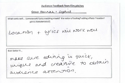
The audience filled in sheets and commented on what worked well and what could be improved on.

What works well?
  • "Good use of editing"
  • "A good variance of shots - the video could be great if the right ones are chosen"
  • "Good relations between music and lyrics"
  • "Good location"
  • "good use of transitions and keeping with the beat"
  • "Narrative theme is good"

What could improve these ideas?
  • "Do not use to much slow motion"
  • "Try colourisation"
  • "Keep editing quick and creative to keep the audiences' attention"
Overall opinions show that the audience like the matching of lyrics to visuals and the choice of locations. In our plan we have a good variance of shots and transitions. For improvements we need to consider more digital effects such as colourisation, and make sure our editing is quick.


* An Audience Feedback Sheet*


Project update

My partner Hannah Taylor has now decided to drop A2 Media Studies. Therefore I will be carrying on the coursework project myself. I am still carrying on with the same artist and the current ideas. I will now be creating and evaluating alone.

Ancillary Tasks

For the next few weeks i will begin to design and create my ancillary tasks. I will be creating a digipak for my artist, james christie's, album and an advert to promote it. These ancillary tasks will follow the video i have created. I will create them using Serif Page Plus, a creative design programme. I will have to create a brand identity for my artist and this will run consistantly throughout the promotional material i will design.

Filming Diary - Day 1

Day 1 - 26/10/10

Today was the day I arranged to film my music video. This was not my original day to film, this date was added as my previous one was unsuccessful. The filming on this day went very well. I managed to film all of the narrative sections of the Video.

I had to travel to brighton for filming with my actors so that i could capture shots on the beach - my location. I had to change some shots that i had planned to have. The weather was quite bad, it was very windy therefore the sea was rough. I had to change the shot of my actor in the sea, however with clever placing of the camera i have captured a shot that makes it look as thought he is walking in to the sea.

I also has to change the shot of the boy dropping a photo into the sea. The wind was strong, so every time he dropped it, it would fly away. I only changed the clip slightly, instead he placed the photo in the water, the shot still works effectively.

A big problem for this day was that my artist never told me this was the day he was returning from holiday. So the day before, expecting him to be there, i got this news and had to plan around the problem. I managed to reschedule a day with him, with a slight change of location.

Issues With Filming

I was planned to film most of my music video this weekend. I had planned to go to Clacton beach with two actors. But at the end of last week my actor ended up on crutches. With so late notice i was unable to find another actor who could spend the day filming with me. Therfore i have rescheduled to film during half term.

Shot List


Here is a shot list of all the shots I wish to capture when filming. I will be taking this list out with me on days of filming. On days of filming I think I will also improvise with my camera with shots that inspire me on the day. I am planning this Thursday in half term and will be at my beach location. It will be a busy day but at the moment all seems to be going to plan. I have found a replacement actor for my previous one and the weather on the day is meant to be good.


On Thursday I am also planning on taking the photography for my digipak. My location inspires my album shots and some photos are stills from the music video I am shooting.

Brand Identity


As one of Goodwin's theory, brand identity is very important. Record labels create a brand identity as a base to sell the artists music on. An artist needs a unique selling point in order to create a market for them in the music industry.
I have investigated how two artists of a same genre and style as my chosen artist, have created a brand identity across their promotional material.

Paolo Nutini is a scottish songwriter and musican. He sells himself on the concept of his music and sound rather than his own image. On his album he has represented himself as a cartoon character. He appears eating at a table. His album is called 'Sunny Side Up'. Through imagry he has played on the words sunny side up and shown him eating eggs.

The typography is a serif font. It runs through both his album cover and website and gives it the personalised touch. Images such as eggs and a photo frame also appear on the website which appear on his album cover.

James Morrison is an english singer and song writer. James sells his music on his own image.His album covers shows him sitting on a cobbled street. The cover is very simple showing the rawness of his sound and pure talent. This image also appears on his website and creates an artist image.

His typography is in a bold red and runs through both his album cover and website. His typography was also the same on his old album but appeared in different colours.


Creating A Brand Identity For My Artist

I have spoken with my artist about aspects he needs to sell his music. At the moment i have a blank canvas to work with, he has no motif or logo, so i only have his music to work with. His inspiration for his music is the ocean. For my video i am running with this theme and would like this theme to run through my promotional material too.

For my ancillary tasks i am creating a digipak for an album and a advertisement for the digipak. I would like to create a brand identity for my artist using both the ocean theme and his guitar. I want to create a base for his music using the concept behind his music. I want to keep his album cover simple with a personalised touch focusing on the pure talent and rawness of his music.

I want to use photography and capture images of the ocean and incorporate them into his album cover and advert. The ocean theme represents the starts of the journey, the start of his new career. This is James' first album and this theme represents him having no boundaries, from this ideology he is free to take his career where ever he wants. The ocean represents his journey and the fact he can go anywhere with his talents, he has no restrictions and nothing holding him back. I want this theme to run through my video and promotional material to create a consistent brand identity and a base that can be linked with the artist.
For typography i would like to use a serif font, a font that will be recognised along side the artist and will correlate with the theme. I would like to keep things simple using the font colour of white with background colours of a deep red and subtle blue . This design would carry through the artists promotional material.

I would like to use images of the artist through out his video and advertising. I want to create a strong recognisable link between his music, sound and him. I'm going to ask the artist to write a paragraph or two for the digipak in an autobiography style, adding to the personalised touch. I want to keep the artist very much involved, allowing me to create a promotional style that matches very well with him.

Photography for My Ancillary Tasks


Click Images To Enlarge

What is a Digipak?

A Digipak is a type of CD packaging. Digipaks are the alternative to a jewel case the common known CD packaging. Digipaks became more predominately used by artists in the early 2000s. It is a book-style paperboard or cardboard design with one or more plastic trays which hold the CD's in place.Digipaks are not used as widely as the jewel case as they are less hard-wearing and more expensive. They are often used for special editions of CD's or albums.


I will be creating a digipak as one of my ancillary tasks. I will be making a digipak rather than a jewel case to market our artist as it enables the audience access to a large quantity of information from song lyrics to artist history. By creating a digipak I am using modern forms of packaging to help create our brand identity. It will share features with other promotional material and the music video I am creating.


Digipak plan

Click Menu to View in Full Screen

My Digipak

My digipak will be packaging for my artists album CD but will also help create a brand identity for him. It will share features from the video, my artist's music and the advert I plan to make.

My digipak will link to my video through its theme. The video will be shot on the beach and the digipak will have photography of the location inside it. The ocean and beach is the inspiration for my artist's music.

Through my digipak I am going to develop a brand identity for my artist. I am going to use house colours of a deep red and white. My typography is going to be a serif font. These colours and font will run consistently through out my promotional material. My Album will be self named. The title will appear in a serif font adding a personalised touch. This will become the logo for my artist and will be recognisable as his star motif. For the front cover I have the image of my artist at a cross roads. This image is predominate in my video too. It gives the ideology of a new beginning. This is my artists first album and from here his career can take any turn.

I will make the pack appealing through clever photography and design. The digipak will include information such as; album name, artist name, track names and the name of the record label. This is industry information that forms a convention of a digipak. These aspects of information appear on all CD packaging.

I plan to make my digipak using IT software such as; Paint and Serif Page Plus.

Magazine Adverts

Magazine adverts are a piece of promotional material that artists use to create awareness of their new albums. They use adverts to promote there album in hope that it will increase sales. They help an artist create a brand identity by following a house style that also is used for the album itself and other promotional material.

An advert that promotes albums would appear on the internet, in music magazines such as NME and also popular magazines such as Heat. They all use the same conventions. They would present;
  • The artist's name
  • The title of the album
  • Pull Quotes
  • Track listings
  • Tour Dates
  • Industry information such as; web addresses, record labels, logos
  • Date of release
  • Where to buy or download the album
Below are a couple examples of magazine adverts. I have analysed them and they show these common conventions.

The Verve


This advert promotes The Verve's single 'Love Is Noise'. This advert is quite simple. The background is a picture taken above the clouds. I think it has been slightly colourised using golds, greens and darker shades. There is little text on the page. It presents
  • The artists name; The Verve
  • The track title; Love Is Noise
  • When the track is available
  • The name of the album the track is from
  • A web address
  • Record label logo
This advert does not promote a tour and does not include any pull quotes. The sky is the theme for this advert, it is photographed in the background. This theme is also on the album cover and the website for the artist. This creates a strong brand identity and them for this artist and their album. It creates a unique selling point.


The Noisettes


This magazine advert is also quite simple. It advertises the new single for The Noisettes. The top two thirds is the single cover. Is it exactly the same. The bottom third carries on the black ground and presents;
  • A tag line
  • When its available
  • A Website
The artist creates a brand identity by using a black background and gold font. This font appears on the website, her album covers and this advert. The image used appears on the single cover and this advert, however the website uses the image from the album cover. This advert has little one it, however I think by designing it like that actually makes the most important information such as title and date release stand out. It creates an impact.


Filming Diary - Day 2

Day 2 - 20/11/10

Today was the day to film the performance sections of my artist. The day went very well. I managed to capture all the shots i wanted and a few extra too.

The location i filmed on was changed slightly. Originally he was due to come to the beach with me and film there. However unable to access the beach again therefore we had to film locally. I chose to film him at a crossroads, an idea i have had from the beginning and also to film him in front of a brick wall, this was a blank canvas that i felt fitted with the genre of the music.

Today i finished filming all the footage i needed to create my music video.

My Magazine Advert - Plan


Click Image To Enlarge

Changes Made To My Advert


My final advert has changed quite a lot to my first plan. I created a draft advert first which was like my original plan. However I felt I could improve it and which the design programme I was using I thought I could make it more creative. So I decided to make a second advert. See changes above.

My Magazine Advert


Click Image To Enlarge

Analysis of my magazine advert

Click Image To Enlarge
My Magazine advert has changed my my original plan after creating a design, this copy is more detailed and more appealing. See analysis above.